Master Pet
Study case
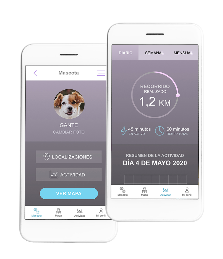
This is a personal UX & UI project that goes from problem identification to a solution in the form of a mobile application. It focuses on helping people find their lost pets.
These situations usually happen in a few seconds, and the pet owner hardly has time to react. Losing a pet can be extremely painful for people, especially those who are more emotionally attached to their pets and consider them as family members.
The goal of the product is to provide resources to help owners so they can find their lost pets quickly.
Methodology
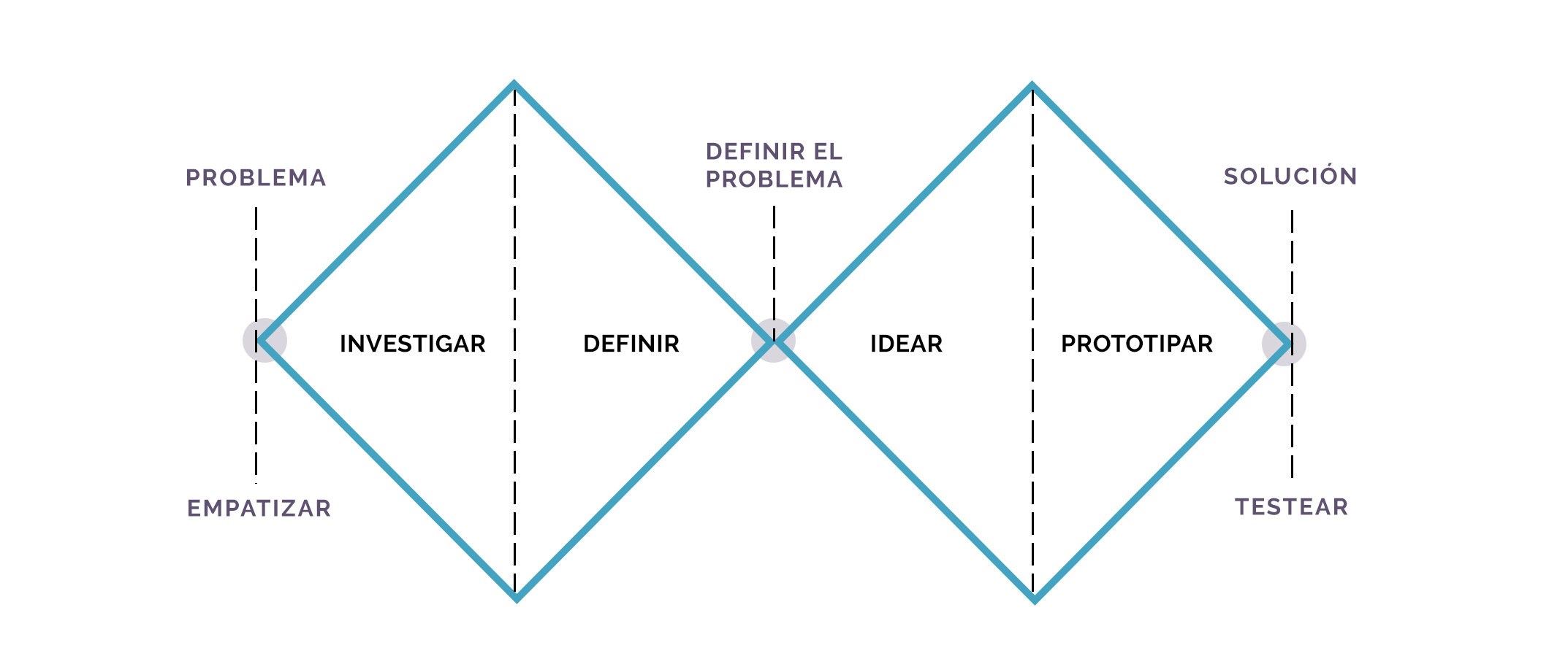
Design Thinking
Abilities
Research Questions, Benchmarking, surveys and interviews, DAFO Analysis, User Persona, Empathy Map, User Journey, Brainstorming, Value Proposition Canvas, User Flow, Wireframe, Moodboard & Branding, Style Guide, Prototype
Tools
Google Forms, Miro, Photoshop, Sketch App, Invision
Context
According to the American Society for the Prevention of Cruelty to Animals (ASPCA), the most important step is to explore areas near the location where the pet lives immediately after the disappearance. Moreover, it is advisable to distribute flyers in the neighborhood, advertise on the Internet, or contact animal shelters. Many dogs get lost on a walk or run away from home for various reasons. Almost 20% are likely to go missing after loud noises, such as fireworks and storms.
From the 21st Century, we can solve these kinds of problems easily through multiple devices. In Spain, the use of microchips is increasingly common; it enhances the possibilities of finding the animal and is mandatory for dogs and cats. However, some people in charge of taking care of pets don't use microchips or haven't updated their personal contact information. Additionally, before the owner locates the pet, it could be harmed or stolen.
Due to technological advances in the last decades, we have more options to find our pets through applications that are able to track animals and collaborate with other users. Some devices include a GPS collar that can track the pet in real time and send an alert to the application with the location.
Investigate
Research Questions
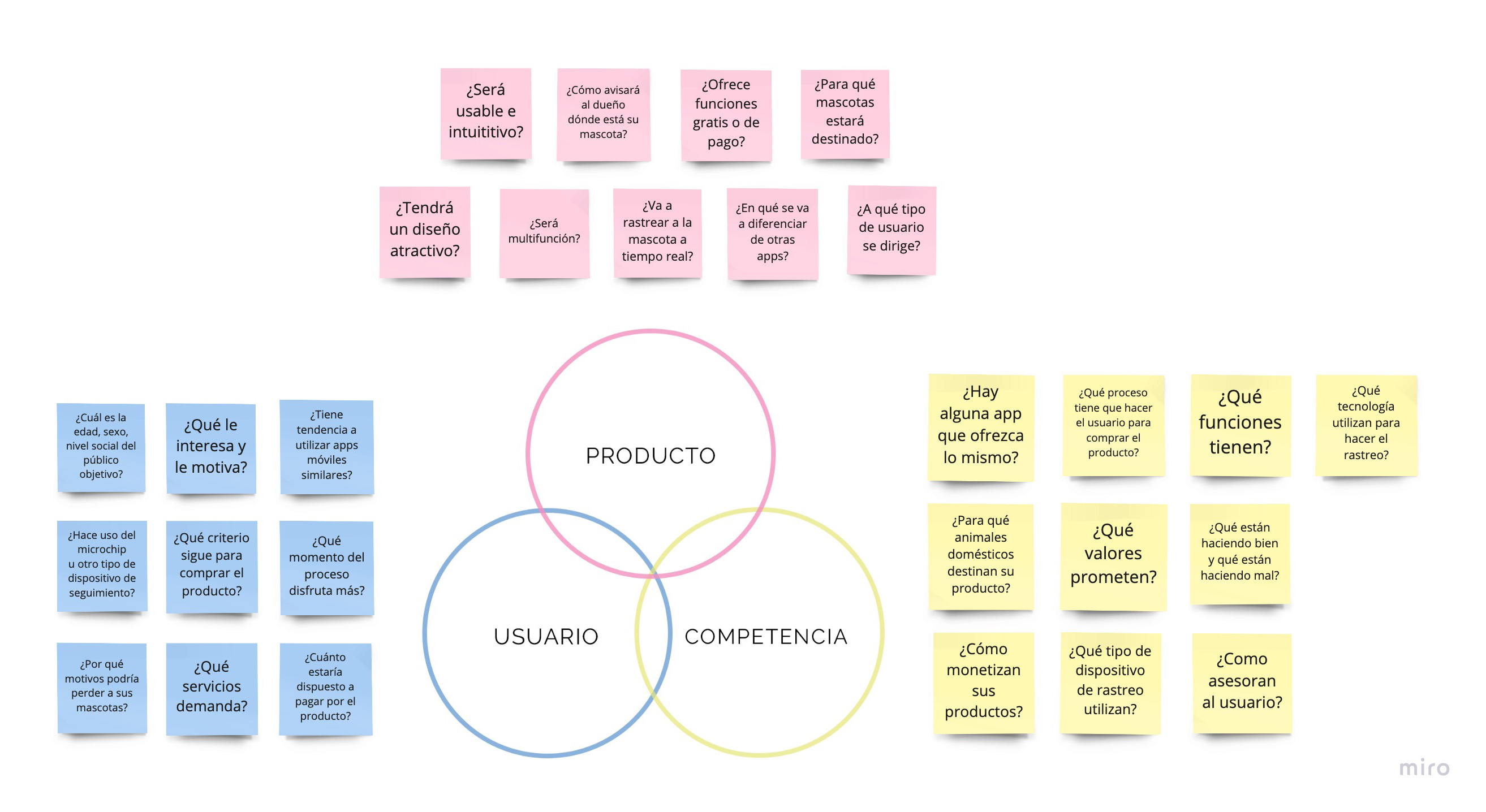
An app with location functions would be viable to solve the problem. I started to investigate, and the first step was to formulate research questions. This process helped me define the doubts I had related to the product, the user, and the competitive market.
Benchmarking
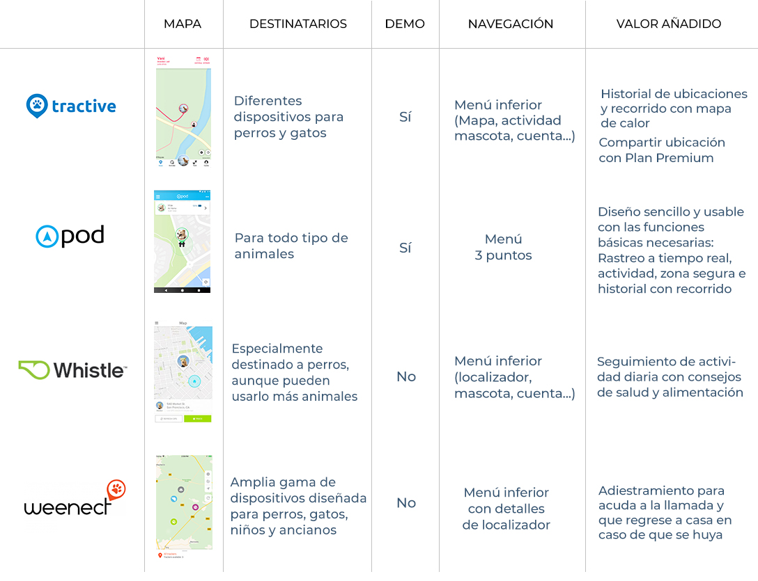
I continued the investigation analyzing the competitive market. I searched for similar products to understand better the user's perspective and needs. I also analyzed good and bad practices in the sector.
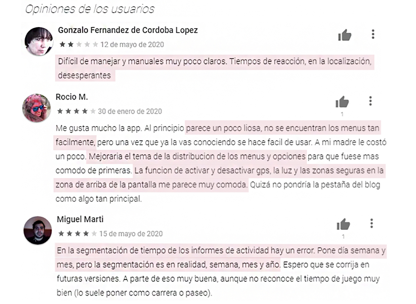
I searched for information about pet tracker apps and read reviews on the App Store and Google Play. Several users were complaining about the lack of instructions or a brief manual providing information about basic features and how to use them because some apps were too complicated for them. They also expressed the need for more intuitive navigation menus and greater ease of use.
In addition, I noted down additional ideas as supporting features, such as sharing the pet's location with other users to assist the owner in locating the animal and displaying physical activity. While most users appreciated these features, they requested improvements, such as the display of statistics and visual charts to facilitate the viewing of reports.
Surveys and interviews
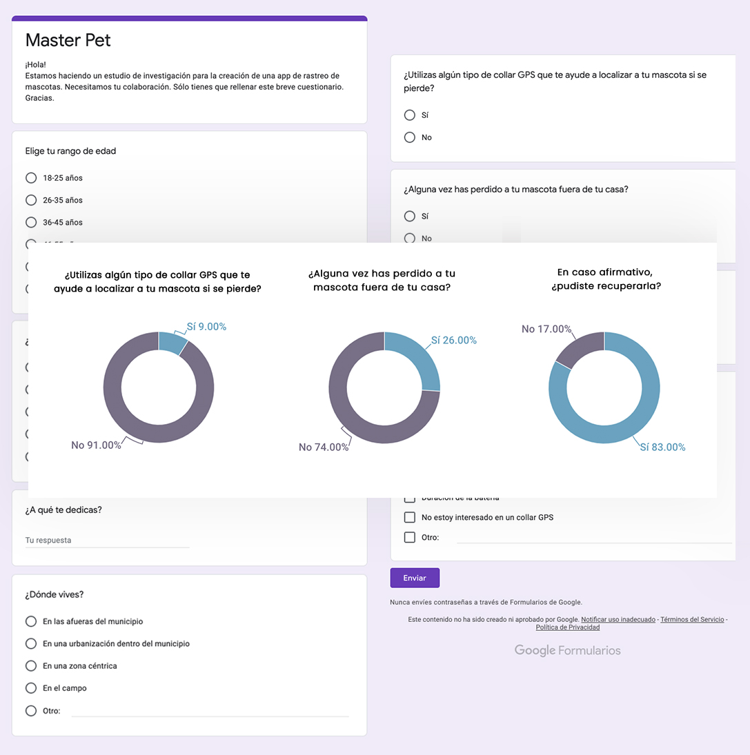
I needed to understand the depth of the problems and the users' context in order to comprehend their needs and motivations. I prepared a survey and posted it on social media and online forums dedicated to animals and pet care. Additionally, I gathered more information by interviewing people who have lost their pets to understand their emotions and how the situations were solved. These were the conclusions I reached:
✓ Of the surveyed people, only 9% had a GPS collar for their pets. The usage isn't very widespread in Spain, unlike the microchip
✓ Elderly people in the interviews appeared to be insecure about using tracking devices. They weren't accustomed to digital technology or mobile applications.
✓ Some people with dogs admitted they let their pets run freely around the neighborhood or in the countryside. However, they were afraid their pets might end up on a dangerous road or encounter other animals that could be aggressive.
✓ People with cats confirmed that their pets were prone to wandering away from home, but they would usually come back after a few days.
DAFO Analysis
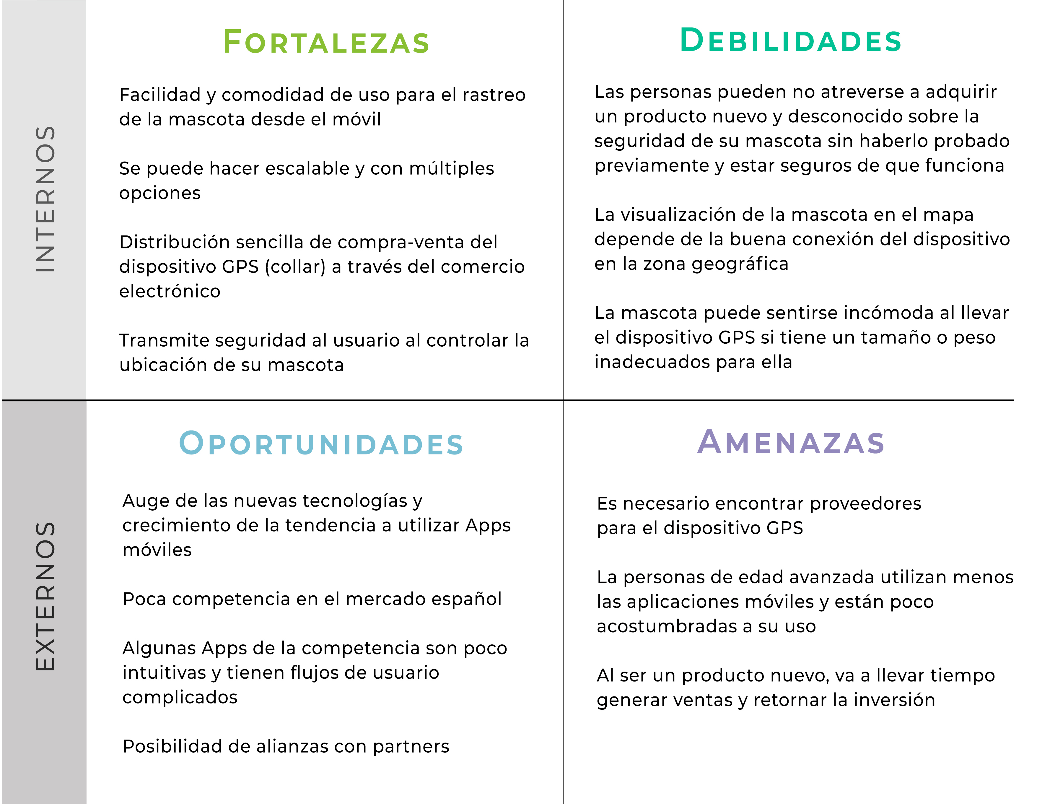
I decided to do a DAFO (SWOT) Analysis during the investigation phase with the objective of assessing the challenge and probabilities of success. I reached the following conclusions:
✓ The application has to be easy to use and intuitive. We should help novice users who have little or no experience with technology.
✓ The use of the product implies buying the GPS collar as well. The app could offer a free demo to allow users to enter as guest users and experience how it works. Most people are less reluctant to purchase a product if they can try it beforehand.
✓ To convey confidence to the users about the product functions, it is important that they have technical support available and provide simple instructions.
✓ An important part of the product's success depends on the quality of the GPS collar. It should fit properly on the animal, maintain a good connection, and not fail in emergencies.
Define
User Persona & Empathy Map
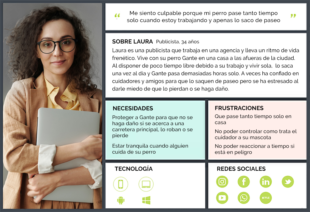
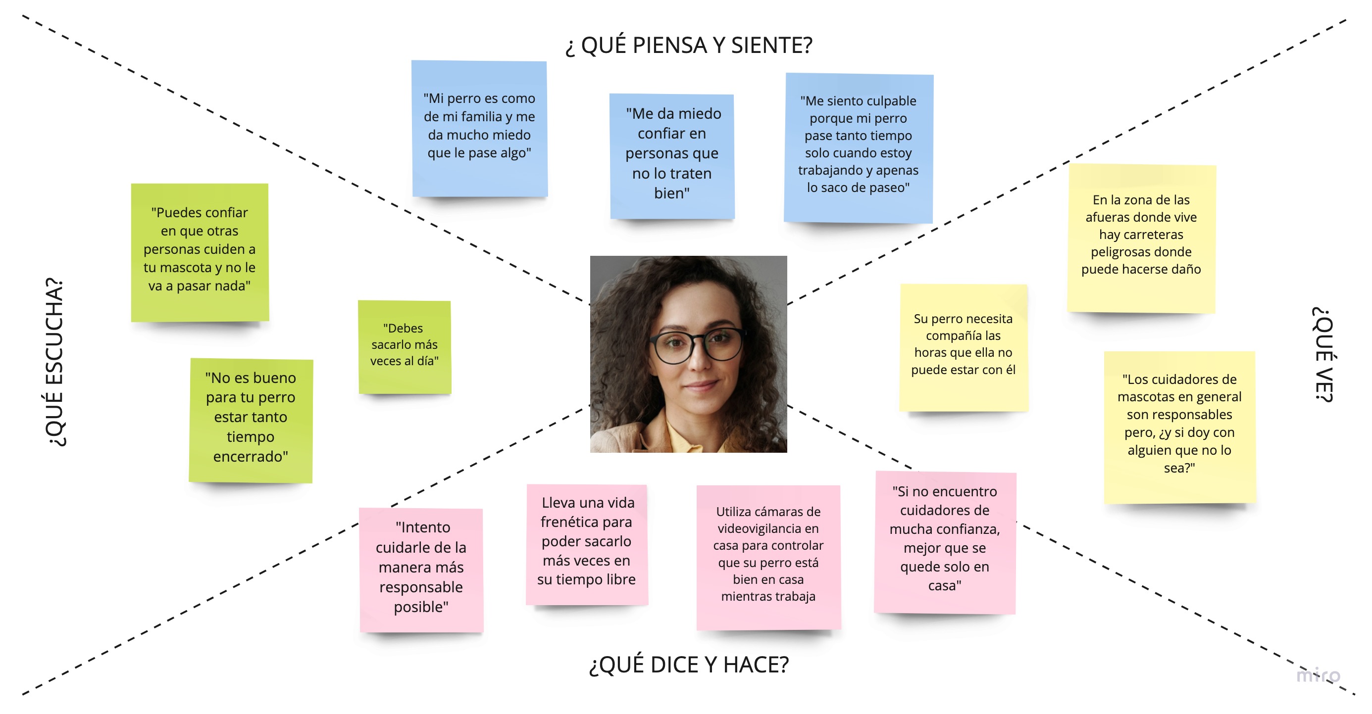
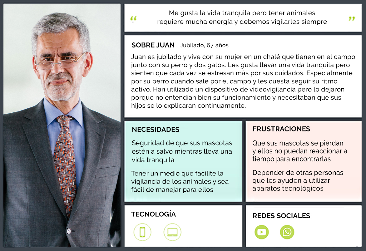
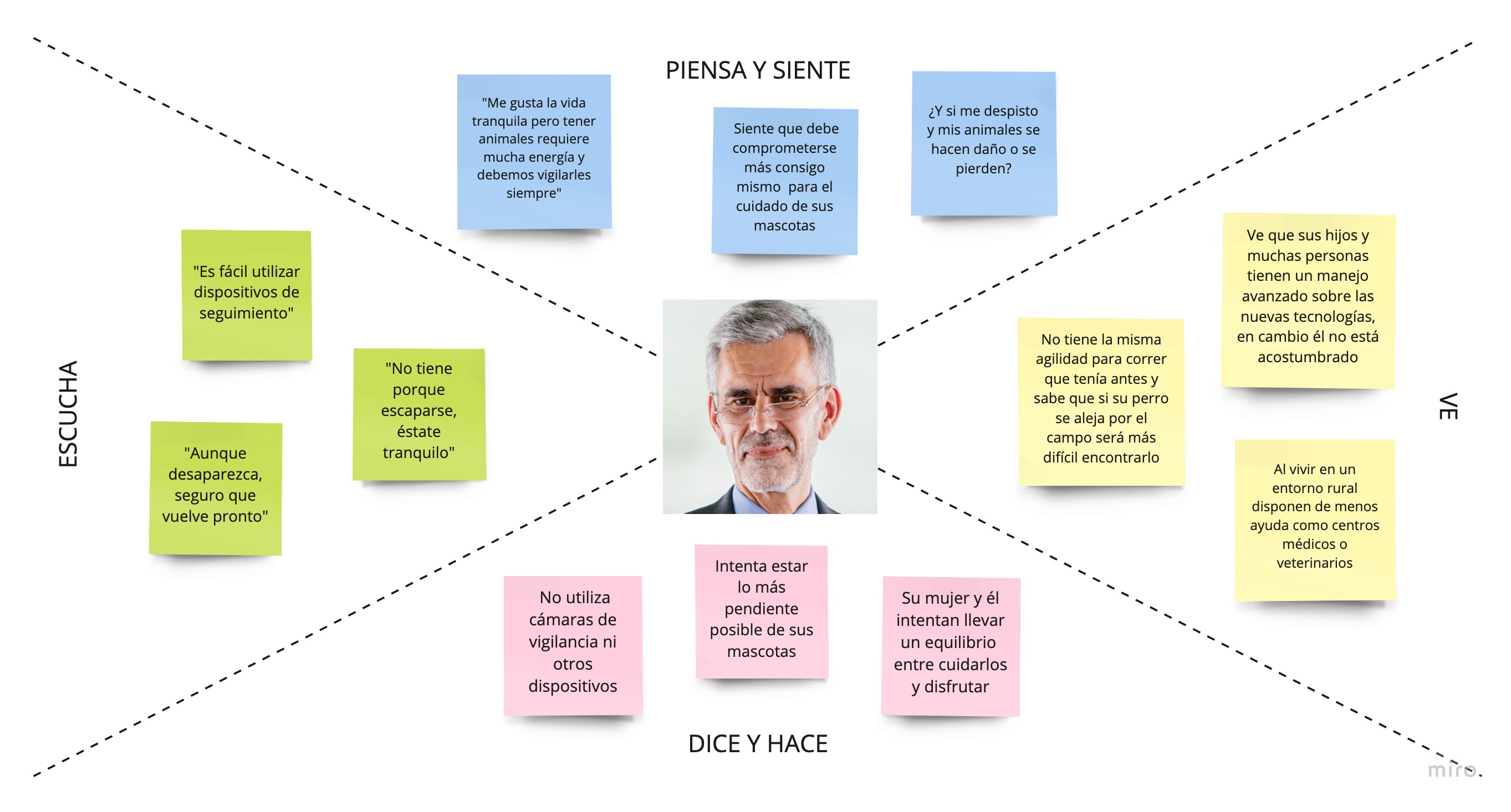
I gathered all the information collected in the investigation phase and defined two user personas: Laura and Juan, then I used empathy maps to understand better the user's thoughts, feelings, actions, and words.
User Journey
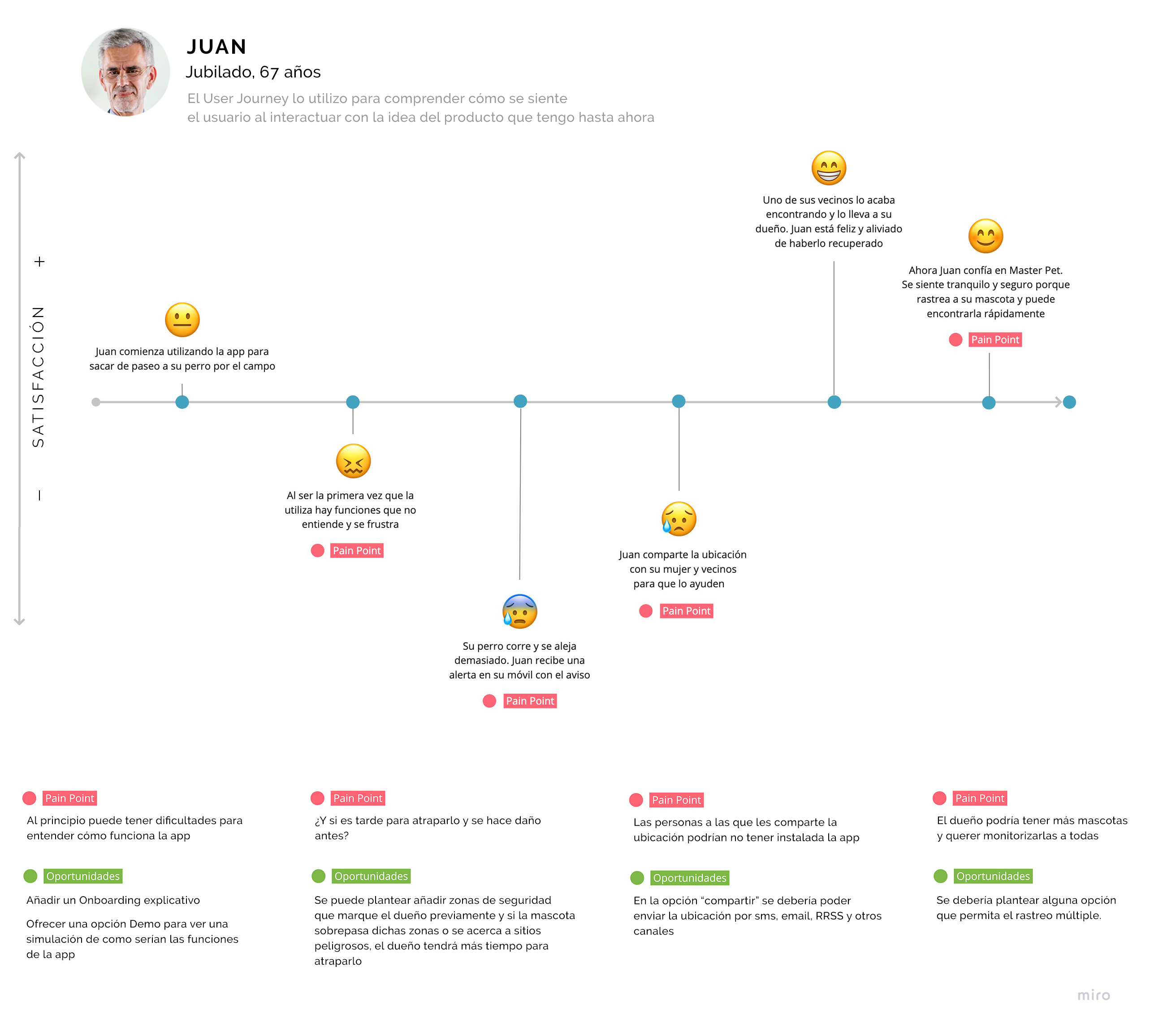
Once the user personas and empathy maps are done, I worked on the user journey to identify the levels of satisfaction and fustration that the user experiences with the use of the product. This tool helped me detect pain points and turned them into opportunities.
Ideate
Brainstorming
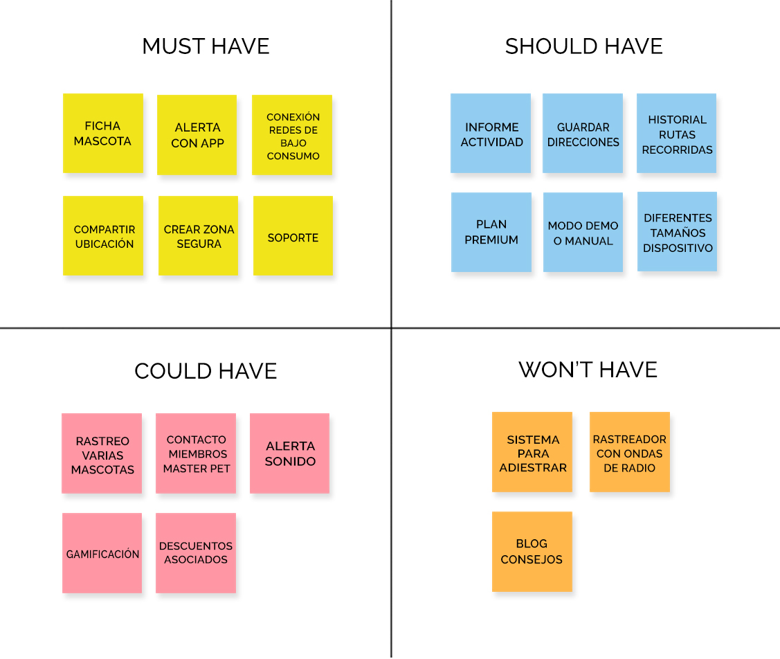
After detecting the design opportunities, it was necessary to conduct a brainstorming session to generate ideas and solutions for the problems identified in the previous investigation and product definition phases. I organized all the ideas using the MoSCoW method to determine which features should be prioritized:
✓ The app must have key functions such as tracking the pet in real time, alerting when the animal gets out of safety areas and being able to send the location with routes and places that the pet has taken.
✓ Other similar products like Weenect had a system to train the animal with vibrations on the GPS collar, offering a differential value. I found it interesting but didn't want to add complexity in use.
✓ The device should use low-energy networks. These locators have large coverage and can track the pet without distance limits and with precision.
✓ The GPS collar should be available in different sizes to fit properly on the animal.
✓ While I was analyzing the prices from competitors and users' reviews, most of them weren't satisfied because they found them too expensive. For this reason, I proposed that my app could have two pricing plans: a free account in which the user only has to buy the GPS collar to gain access to the basic features about tracking. On the other hand, the premium account would offer additional features such as discounts on pet supplies or veterinary stores and tracking several pets at the same time.
Value Proposition Canvas
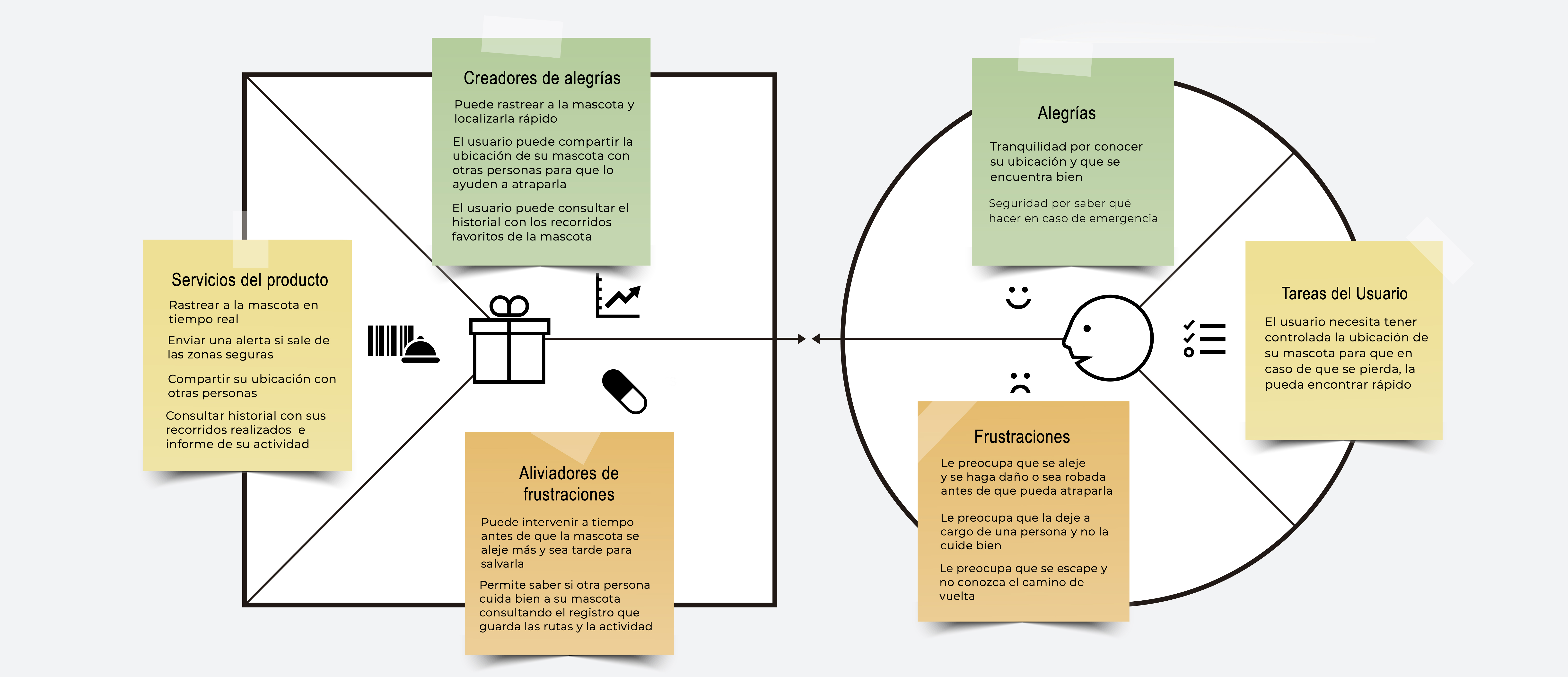
After I had a more defined idea about my product, I started to work on the value proposition.
User Flow
I designed the User Flow to gain a deeper understanding of the steps and interactions that the users would take to track their pets.

Site Map
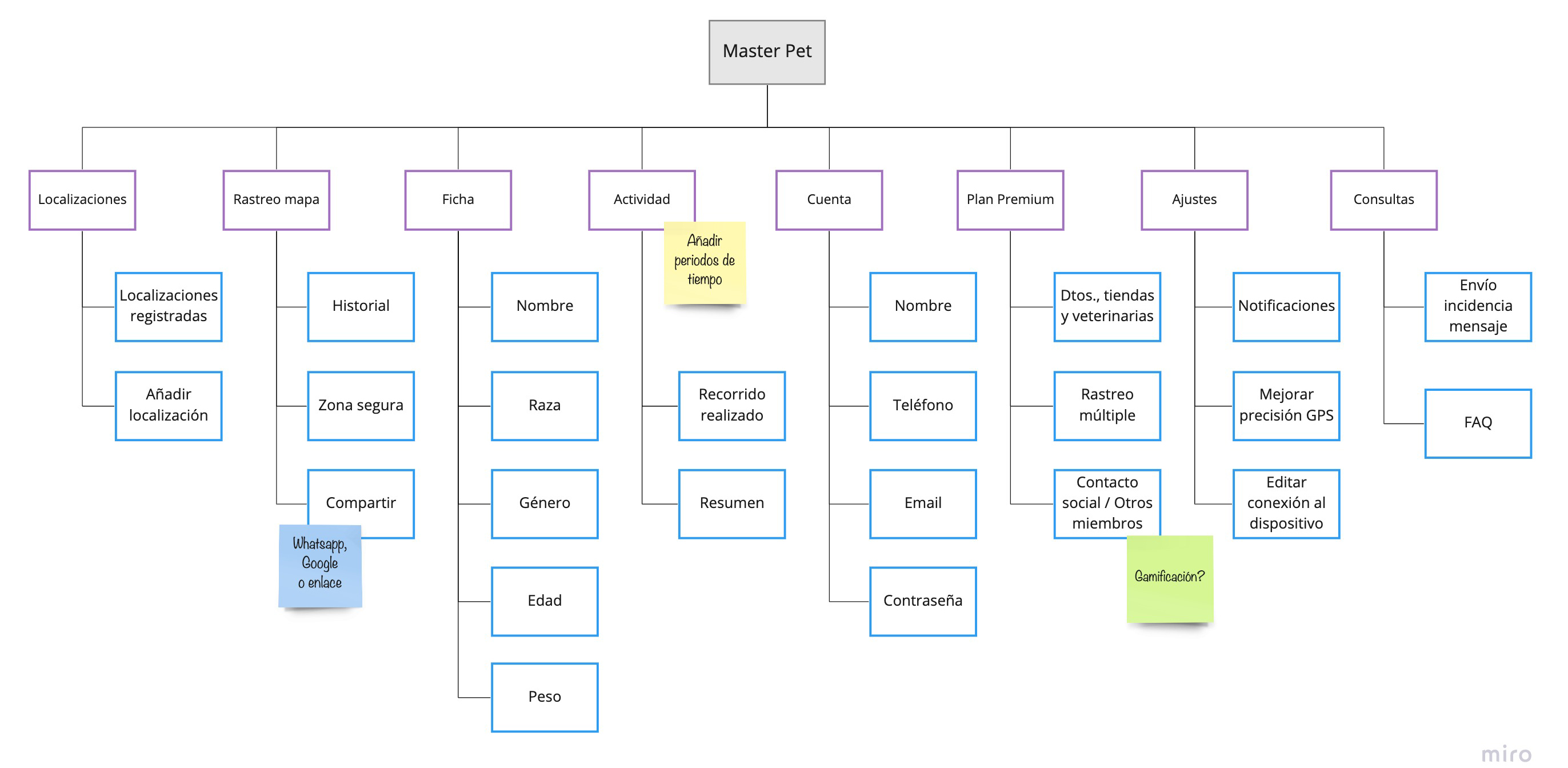
To define the information architecture, I created a Site Map to illustrate the content organization.
Prototype and iterate
Low & Mid Fidelity
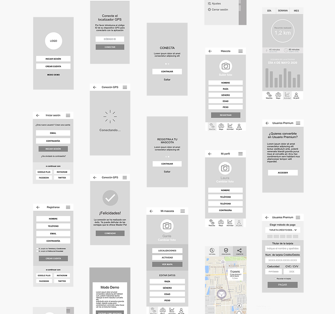
I drew quick sketches, initially using paper and pencil and later utilizing the Sketch program. I wanted to see the flow and screens without a high level of detail.
Moodboard & Branding
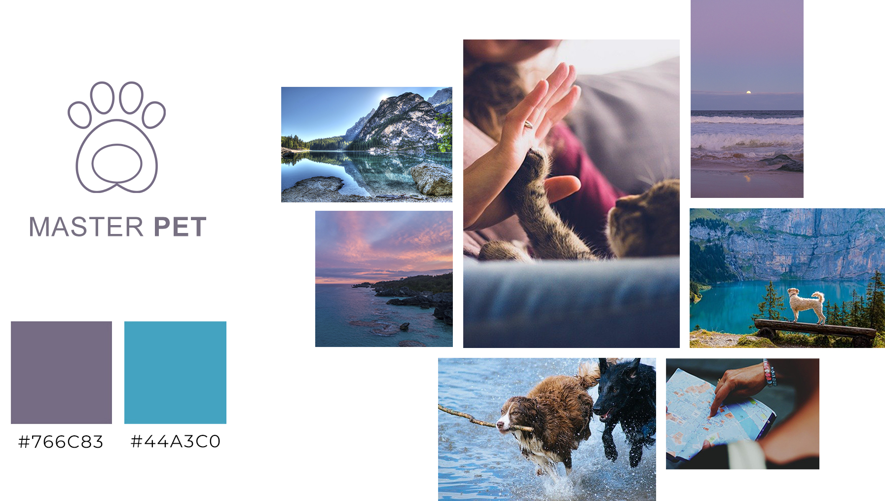
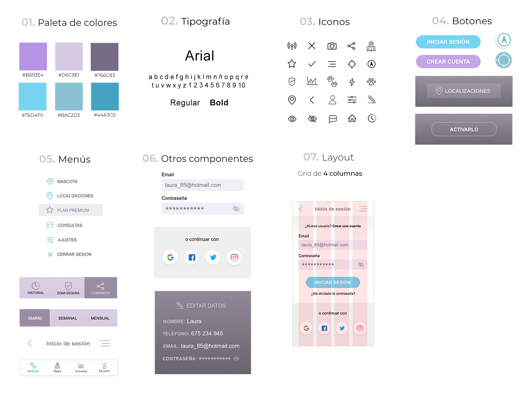
The Moodboard helped me select the main colors: purple and blue. According to color psychology, the purple color is associated with fun and originality, values I wanted to convey. On the other hand, blue is related to calm, loyalty, security and trust. These two colors differ from the competency because they normally use other color tones such as green, brown and orange.
As for typography, I chose Arial, which offers multiple weights and is a legible font even in small sizes.
The brand should be fresh, humorous, and effective in communicating its sector. I designed the isotype to represent a paw print made by a dog or cat because the product is focused on them. The chosen name is "Master Pet" because it includes important functionalities related to pet control and care.
Style Guide

High Fidelity
Prototype
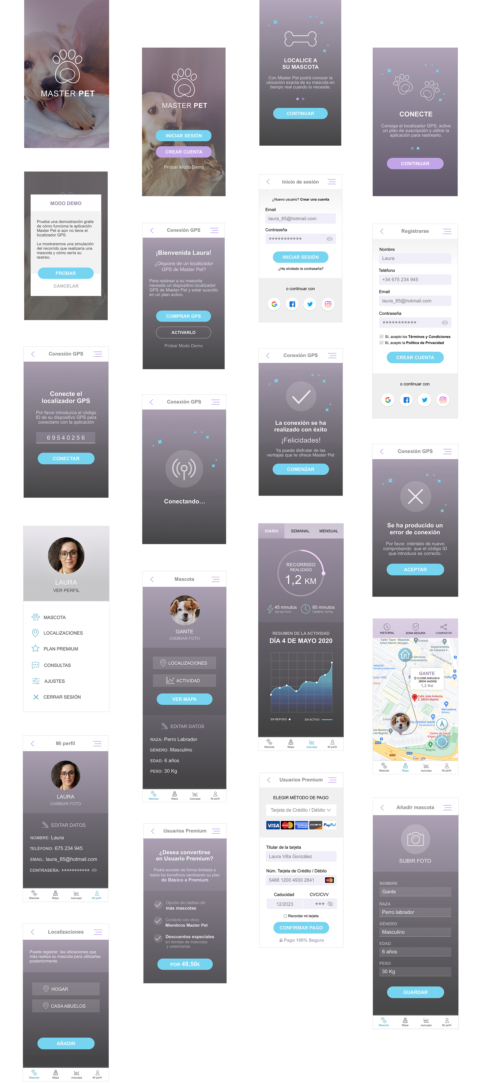
On the prototype, we can see the user flow: creating the account, activating the GPS with the ID code and connecting it, adding the animal's data, accessing the map, activities, history of routes taken, safety areas, and sharing locations. The app offers two pricing plans:
✓ The user has access to basic functionalities for tracking and controlling the pet. The client only needs to purchase the GPS device on this plan.
✓ Premium account: For an additional payment, the client can gain access to other functionalities, such as special discounts on pet supplies or veterinary services, the ability to connect with other users, and the capability to track several pets simultaneously.

